The X-Chart is a plot of every data point without any averaging. These charts often include the average of the data points (X-Bar) and control limits. Control limits can be set using actual or absolute limits the measured item must stay within or can be based on a standard such as Six-Sigma.
An example of actual or absolute limits can be that the material thickness must be between .07685” and .07485”.
Six-Sigma limits when applied to process measurement data usually are calculated +/- three-sigma from the running average. While it doesn’t tell you if the measurement is within spec. It does tell you if it’s in control.
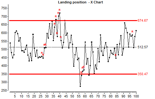 Fig 1
Fig 1
X-Bar chart
The X-Bar chart averages multiple data points together into a sub group then plots the average or mean of the sub group. This is also called statistical smoothing. The more points in the sub group, the smoother the chart becomes. You can see this between the X-Chart (Fig 1) above and the X-Bar chart below (Fig 2). Which both use the same data. Using an X-Bar chart is beneficial when the data is noisy or has a lot of variance. Smoothing the data can show trends that are hard to see in the raw data. The disadvantage is over smoothing the data can lead to misreading or misrepresentation of the information.
An X-Bar chart will usually include limits calculated to show control, not specification. The center line in this chart is the average of the averages or X Double Bar. (Fig 2)
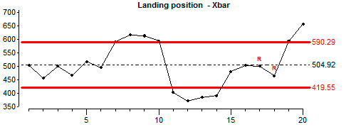 Fig 2
Fig 2
X-Bar and Range chart
The X-Bar and R (range) chart can be displayed in two ways.
In Figure 3 the X-Bar chart is included in the top part of the chart and the range chart in the bottom. The range chart shows how much the sub group varies. Each point in the range chart corresponds to the point in the X-Bar chart above it. The larger the value the larger the difference is in the values within the sub group. Reading this chart can help prove the validity of the X-Bar chart. It is also a great indicator of control.
In Figure 4 the range chart is combined with the X-Bar chart. The size of the bars indicates the range of the values in the sub group. The point is the average of the group just as in the standard X-Bar chart. This type of chart can also be an X-Bar and Median, where the point is the median of the group.
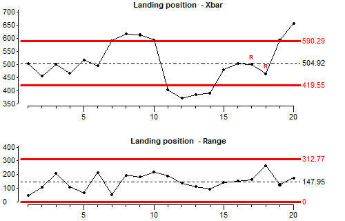 Fig 3
Fig 3
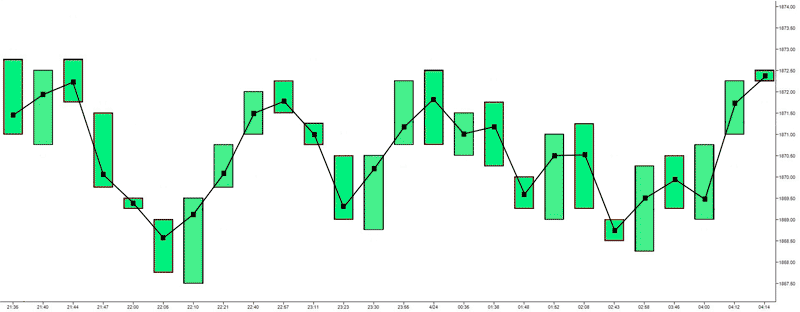 Fig 4
Fig 4
X-Bar and Standard Deviation chart
An X-bar and s (sigma) chart is a special purpose variation of the X-bar and R chart. It is used with processes that have a subgroup size of 11 or more. X-bar and s charts show if the process is stable and predictable. They can also be used to measure the effects of process improvement ideas. Instead of using subgroup range (R) to chart variability, these charts use subgroup standard deviation (S). Because standard deviation uses each individual reading to calculate variability, it provides a more effective measure of the process spread.
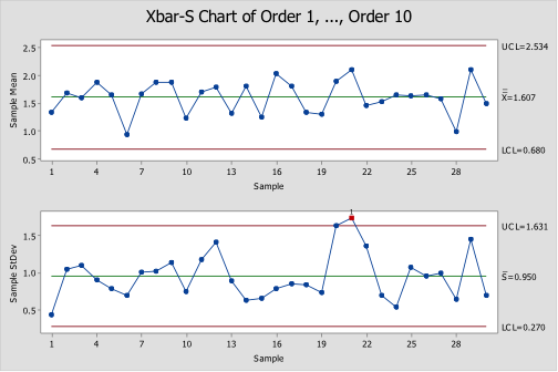 Fig 5
Fig 5
Run chart and Trend chart
A Run chart is a line graph of data plotted over time. By collecting and charting data over time, you can find trends or patterns in the process. Sometimes the data has a lot of variation between data points and the trend is not as obvious. In these cases, the trend can be calculated and graphed over the run to make understanding the trend direction easier.
Because run charts and trend charts do not use control limits, they cannot tell you if a process is stable. They simply show you how the process is running. The run chart can be a valuable tool at the beginning of a project, as it reveals important information about a process before you have collected enough data to create reliable control limits.
 Fig 6
Fig 6
Histogram
The histogram is the distribution of a set of data and is usually presented in a bell-shaped curve showing most frequent measurement in the center and less frequent measurements to either side. Typically, histograms use individual data points but it can also use sub-group data or classes to simplify the graph.
This chart is a good indicator of tightness of control in the process. The steeper the curve, the smaller the standard deviation and more control the process has.
Histograms can be used to predict outcomes or probability of the data repeating. In Figure 7 we could predict that additional coils are going to be 600.20 microns in over all thickness. Also, when they are outside of that measurement, they will be toward the thicker side.
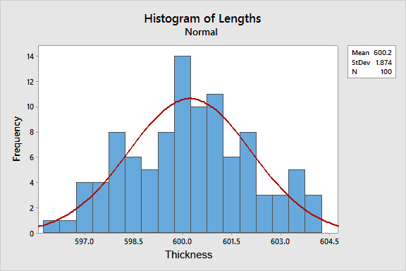 Fig 7
Fig 7